The digital and marketing landscapes are shifting. User expectations are becoming more and more demanding and customers anticipate a timely, personalized, and integrated experience with your brand across all devices and channels.
Creating great digital experiences isn’t a one-time deal. As you learn more about your users and their behaviors, you need to be able to respond and shift quickly. Meeting these constantly evolving demands can be tough as you need the appropriate technology, data, and content working seamlessly together in order to provide customers with relevant messaging and information depending on where they are in their buying journey.
You can take a huge step in the right direction by implementing a design framework that affords you the consistency and flexibility needed to create better user experiences and implement faster response times.
What is Modular Design?
A modular design framework, sometimes referred to as “atomic” or “component” design, is an approach that is starting to gain traction and is, quite frankly, well overdue.
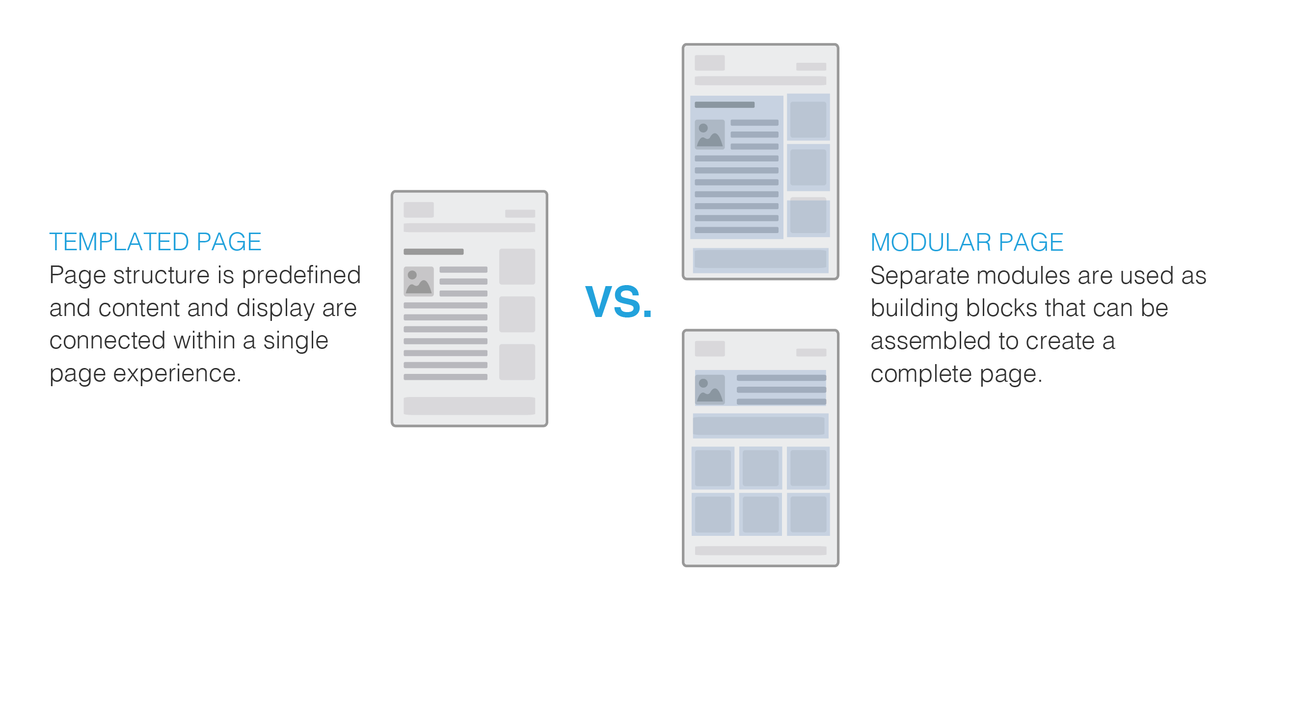
Traditionally, website design and development has relied on page templates that predefine how content is structured and displayed on a page. Static templates put limitations on the way content is created and displayed, and changing or creating new templates often requires a pretty big development lift.

Modular design allows us to think about content creation and webpage design in a totally new way. A modular design framework provides a foundational set of UI and UX patterns on which to build your website. Rather than building complete pages using rigid page templates, you create building blocks that can be flexibly and dynamically assembled into pages.
Why is Modular Design the optimal approach?
The benefits to modular design are, in my humble opinion – endless! But the top five reasons are clear:
- Freedom
With modular design, your marketers and content producers will finally be free from the shackles of templated webpages. They’ll be able to manage and control content outside of the confines of a predefined layout, allowing content to drive design.
- Flexibility
The framework provides a foundation for responsive design, adaptive content, and shifting priorities. Modules can be dynamically displayed or hidden depending on business priorities, device, or even defined user profiles (hint: personalized experiences = happy customers and higher conversion rates!). By ditching traditional page templates, you are never stuck with a final site design that is unable to meet future needs as they arise.
- Consistency
With modular design, you can build consistent experiences across your website with a set UI style guide. Internally, content producers, designers, and developers will have a clear direction for creating and displaying content. Externally, you’ll maintain a consistent brand voice and visual identity, and your users will start to recognize and rely on the UI patterns on your site, making it easier navigate and respond to calls to action.
- Faster development and deployment
While it may take some work to build the foundation for a modular framework, you’ll more than make up for that investment with faster workflows and publishing times. Teams will be able to move faster because content, design, and development are aligned in the form of modules and elements. Developers understand the specific data sources and structure needed to create modules. Marketers and content producers can quickly react to data insights, repositioning content, or quickly creating new landing pages without having to involve design and development teams. And, finally, as new needs arise, you won’t have to throw the baby out with the bathwater and completely redesign your site. Modules are building blocks, so you can continue to build out your library of modules to meet future requirements.
- Reusability
The mantra “reduce, reuse, recycle” isn’t only for saving the planet! Embracing reusability will have positive impacts for your website and your business. In this framework, modules are scalable, replaceable and reusable. Once you’ve built a module, you can use it across your site on different pages or make small tweaks to an existing module to solve a new UX challenge. With this framework, you won’t need an entirely new build for every new product, program, or marketing campaign. And by separating content from display, you can create content once and publish it everywhere – saving the time it takes to rewrite or recreate content for different channels or contexts.
Have you implemented modular design at your organization? Learn how Celerity is powering digital design for our clients here.


